


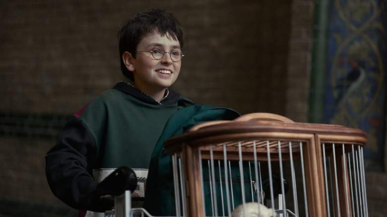
With the first season of “Harry Potter” almost here, there are new details emerging. The latest one is the redesign of the house crests, which fans already have their thoughts about. And they’re not good thoughts!
The Hogwarts houses are important to the DNA of “Harry Potter.” People hope or expect to find themselves in particular houses due to family legacy, but it’s up to the Sorting Hat at the end of the day. Sometimes, people feel like they could belong in two houses, and the Sorting Hat will take a person’s preference into account, as it does for Harry when he doesn’t want to be in Slytherin.
HBO Reveals the ‘Harry Potter’ House Crests
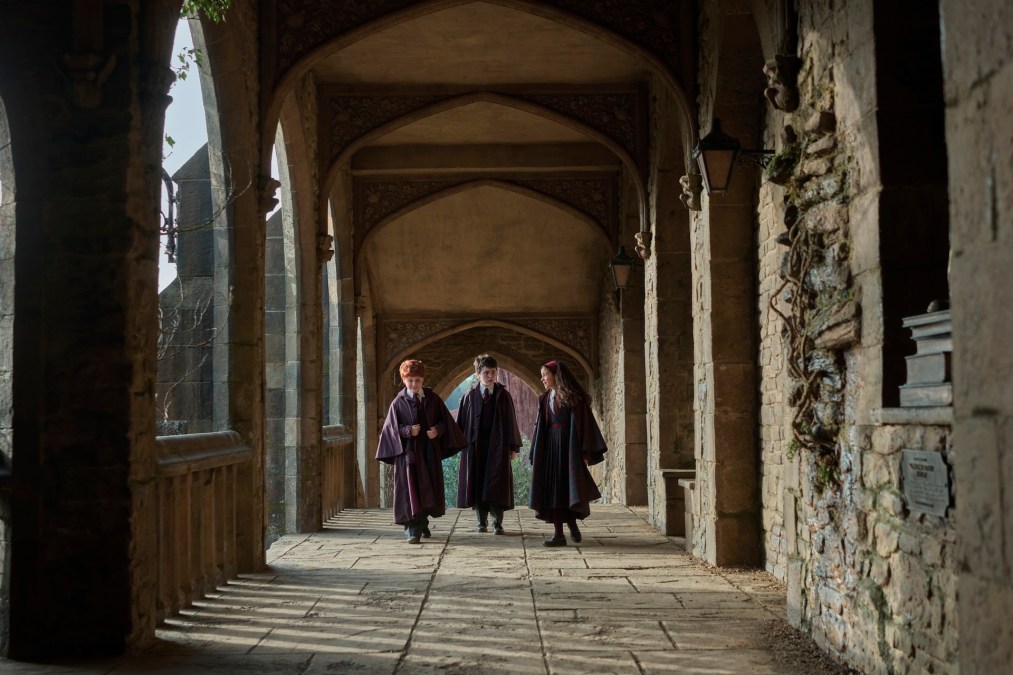
During the Back to Hogwarts event, HBO shared a few new details about “Harry Potter” Season 1, with one of those pieces of information about the new house crests. While the colors are the same, the new crests are completely different, adding a minimalist look and putting focus more on the animals than the medieval-style crest.
Fans have immediately reacted negatively, with many sharing that they look “cheap” and that HBO didn’t put in any effort into the development of them. Some have even said the crests look “sloppy.”
The original crests created by Warner Bros. for the movies had a grander look. They were designed to look like traditional crests that houses of royal families would show off. The newer crests are simplified, and in a way, they look a little more like the “Game of Thrones’ banners, which puts the focus on the animal or item at the heart of the house, whether it’s the dragons, the direwolves, or even the flower of the Tyrells.
The Potter Worldwide X (formerly Twitter) account put the two crests side-by-side, allowing for fans to make their comments and compare the two styles completely.
Fans React to the New House Crests
The opinions have been overwhelmingly negative, with one user sharing, “I prefer the ones from the movies anyway lol way prettier.”
One user seemed to defend HBO in a way, noting that minimalism has become a far more common thing everywhere in the world, and not just in terms of TV, by saying, “Minimalism is the cancer of modernity. Holy s–t, what a horrific thing.”
Even those who prefer a minimalist life have shared that the original crests looked better. However, there have been some who have defended the new look, especially when it comes to Ravenclaw.
One fan commented, “Considering the side of HBO has the eagle on Ravenclaw respecting the house description of the books it has some extra points.”
A second followed suit, sharing, “At least the new ones has Ravenclaw’s mascot correct.”
A third even commented on how the newer ones have their place for the TV series, while also noting that Ravenclaw’s is more on-point: “I like the new one a little more! It’s simple, more organic looking in design, and has the correct symbol for Ravenclaw!”
It’s not the first time fans have commented on the decisions made for the new series. While there have been some positive remarks about casting decisions, there have been others noting how changing the race of characters can set up for difficult depictions of the story later on.
There are many also calling to boycott the series due to J.K. Rowling’s personal remarks about the transgender community. In fact, this has led to comments toward some of the actors who have decided to take part in the TV series, including against Nicholas Hoult, who just recently had to step down from “Harry Potter” Season 2.
“Harry Potter and the Philosopher’s Stone” will premiere on Dec. 25, 2026, on HBO and HBO Max.









Comments
The New House Crests on ‘Harry Potter’ Have Been Revealed — And Fans Have Thoughts